Tilt
For this project, I worked on a team of three designers to create a new feature for Tilt, a college application tool. The new feature would allow users to complete a questionnaire and provide them with a curated list of colleges to explore.
This project was completed in collaboration with Tilt's CEO and founder.
team:
three designers
role:
Project Manager, UX Designer and Researcher

timeframe:
three weeks
tools:
Competitive and comparative analysis, feature inventory, wireframes, prototyping, usability testing, iterative design, style guides
Getting to Know Tilt
Tilt is a small company with big value: they provide simplified financial reports to high school students to help them easily compare the costs of attending different schools.
Since user feedback has shown that college students are interested in more than finances, Tilt wants to expand its product. Their founder wanted a feature that will create a customized list of schools for a student to select from based on their preferences and unique needs.
First, we analyzed the current site.
Tilt already has a strong visual brand:

User Dashboard
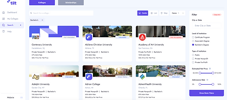
College Search Page
Our goal was to create a new feature for Tilt that could be seamlessly integrated into the current system. The new feature needed be as easy to use and beautiful to look at as the website is now.
Our initial task required a research plan that would help us understand the needs and wants of our user: high school juniors and seniors around the country.
The more we dug into our research, the more it became clear how complex the users and our task really were.
Detailed analysis of competitors and similar products
A survey of 30+ future college attendees
User interviews of 3 high school seniors
Detailed conversations with former college students
Research
Our initial task required a research plan that would help us understand the needs and wants of our users: high school juniors and seniors around the country.
Detailed analysis of competitors and similar products
Several major competitors in the college application product space already have a huge range of data available to students, so Tilt will need a different way to stand out.
A survey of 30+ future college attendees
Factors such as cost and location are most important to students. Tilt already helps students sort by those factors - an easy win!
User interviews of 3 high school seniors
Students use a diverse range of strategies to decide where to apply. Many students are focused on student life and a sense of belonging. Tilt doesn't currently have the resources to provide details on these topics, so we needed a different way to find those students' the information they need.
Detailed conversations with former college students
Students' happiness at college was based on a mix of factors such as a sense of belonging, the amount of debt they accrued from their school, and their ability to find a school with the program they most liked. Again, these were factors we would need to account for in our new feature.
The more we researched, the clearer it became how complex the users and our task really were.

From User Personas to User Archetypes
With such a diverse range of users, creating one - or even two or three - persona would not work. Instead, we decided to use the insights we pulled from our affinity mapping to create archetypes of the users Tilt can support.


THE PROBLEM:
College seekers need a simple way to find the exact college that fits their needs and goals because no one website or resource has all the information they need.
How might we...
...provide details of the colleges that students are looking at?
and
...help students determine their needs and goals for college?
so that we can
...narrow down each student's list of choices for colleges?
and ultimately
help each student find their "perfect fit"?
Tilt's competitors have extensive data to help students find a school. We needed to make Tilt stand out in a different way.


THE SOLUTION:
Tilt is a comprehensive college planning website with a unique feature that uses surveys and activities to hone in on each student’s “perfect fit.”
From Research to Design
If Tilt can't compete with other sites' extensive array of data, we'd need a new solution. We identified three areas that could help Tilt stand out:
Personal
Unique
Fun
Updated Onboarding
By using onboarding to get answers about the factors students care most about, we'd have some information to start with and could customize search results right away.
The Archetype Quiz
Students would take a quiz, similar to one they might see on Buzzfeed, that would tell them which archetype they fit into. We named this feature the "College Search Style Quiz."
MeetU Feature
The MeetU feature pulls up a college that meets students' needs that they haven't reviewed. They can "swipe" left or right. If they "match" with a college, it's added to their My Colleges list to explore later.


Usability Testing and Results
We performed two iterations of usability testing and edits.
71%
5 out of 7 users were unsuccessful in finding the MeetU function without error.
100%
All users expressed excitement about the College Search Style quiz and completed it without error.
57%
4 out of 7 users were unsuccessful in completing the MeetU user flow without error.
To alleviate problems with the MeetU user flow, we added 3 onboarding pop-ups to show users how it works. In our second round of testing, 100% of users completed this flow successfully.
Selecting Features for a Final Prototype
As much as we liked both the College Search Style quiz and the MeetU feature, we knew from testing that both features together was overwhelming. Without more time to find a way to connect the features or make their differences more clear, we decided to move forward with the College Search Style quiz alone. Research showed users preferred it.
Updated Screens

The bar along the top of the page features a note of welcome and an illustration to humanize the page.
Our client didn't want to add our list of search preferences to the onboarding process, so we added these questions to the dashboard. The pink serves as a call to action.
We added a Getting Started Guide to give the site a chance to "talk" to the user on their first log in. The text can validate the user's anxieties and provide a few getting started hints. This card can be minimized or removed, then accessed again in the Help section.
Our users repeatedly mentioned that the college application process is stressful and confusing, so we also added a calendar and To Do list. The first two items on the To Do list are a reminder for the user to fill out their preferences and take the quiz.

Because our users were universally delighted to see their search results, and because that feature is such an important part of the updated site, we gave the quiz results page space to highlight the user's results. A big illustration highlights the uniqueness of their particular style.

The top bar changes to reflect the user's search archetype.
Once users fill out their preferences, they're listed along the top of the page as a reminder. Users can change their preferences any time under Settings.
After taking the quiz, the dashboard features a section devoted to their archetype. This section includes basic information, tips, and recommended articles. It can be minimized or removed from the dashboard and accessed at any time in the user's profile.
Final Prototype
Next Steps:
-
Expand the College Search Style feature so students can rely on it for tips and recommendations throughout their search process.
-
Refine the MeetU function so it can seamlessly integrate into the site without adding more confusion
-
Continue usability testing with the high fidelity prototype
Learnings:
-
A well-researched and tested product revealed so much that we wouldn't have understood with a shortened time frame. By staying open to a variety of methods and learnings, our product was that much richer.
-
User personas don't fit every product because not all products can or should be designed for a limited audience. In this case, with an audience consisting of high school juniors and seniors across the country, archetypes were a stronger way to understand our users and design for their different needs.